COVID-19: Validating Related Patient Data with Graphs
How Neo4j and Git history helped reveal suspicious relationships, report them to local governments, and trace later corrections.
In early 2020, I was looking for case-level COVID-19 data in Japan.
When the number of reported cases was still small, individual case information could be found on the website of the Ministry of Health, Labour and Welfare. As the number increased, however, information became distributed across prefectural and city websites.
Several useful dashboards presented case lists, totals, and maps. My question was different: could the reported relationships between patients help reveal possible transmission routes and patterns of spread?
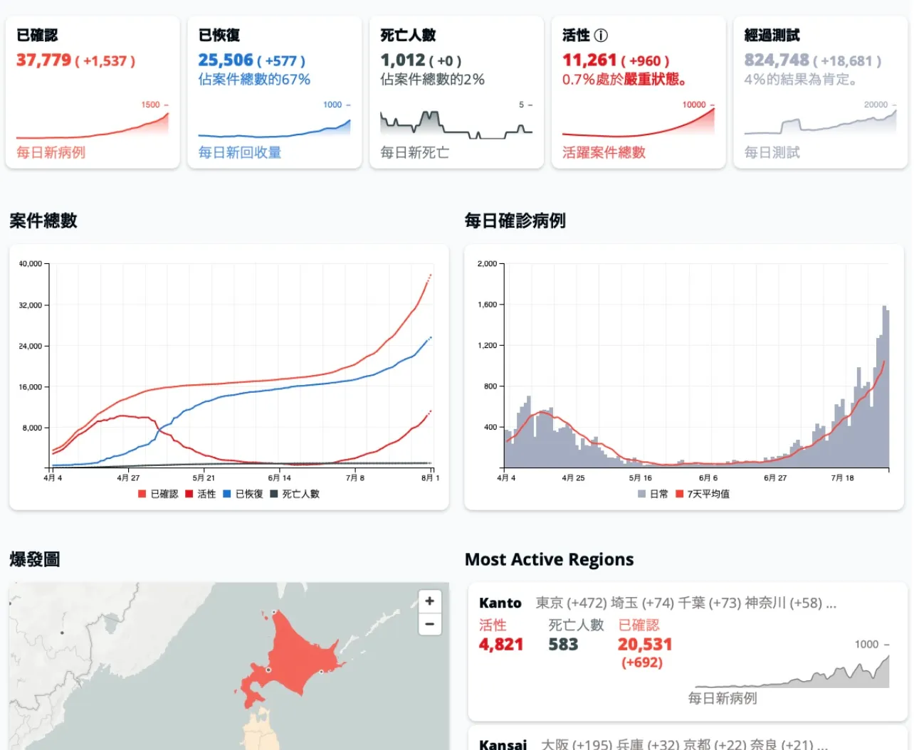
That search led me to the Japan COVID-19 Coronavirus Tracker. In 2020, I joined the project as one of its data maintainers.
The project collected case information from national and local government sources across Japan. Its dataset was maintained on GitHub, which meant that additions and corrections could be followed through commits and diffs rather than being overwritten without a visible history.
The Question Behind the Graph
Some government announcements included a field such as “Related Patient.”
The value was not always expressed in the same way. It could refer to another patient by number, or it could describe a relationship such as parent and child. In a table, these appeared as separate numbers or text values, making their wider context difficult to see.
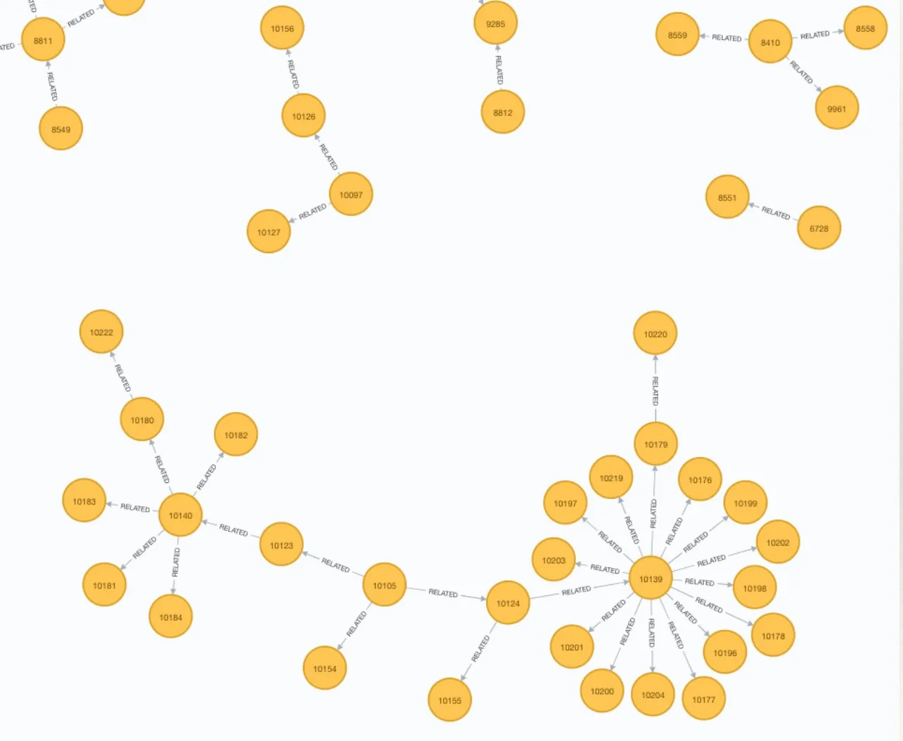
I loaded the data into Neo4j and represented those references as relationships.
(:Patient)-[:RELATED_TO]->(:Patient)Once the data became a graph, it was much easier to inspect which patients were connected and whether those connections made sense in the surrounding context.
Some relationships that looked ordinary in a table appeared implausible or inconsistent in the graph. This helped identify cases where the original “Related Patient” value might have been incorrect.
Japanese note:
私が見たかったのは感染者数の一覧や地図だけではなく、「関連患者」から感染経路や拡散の形を確認できるかということでした。「関連患者」をグラフの関係として表すと、表では気づきにくい不自然な関連付けを見つけやすくなりました。
Data That Changed Every Day
COVID-19 data was not static.
New cases were added almost every day. Existing records were corrected. Publication formats changed. Related files were sometimes updated at different times.
Maintaining the dataset therefore required a repeated process rather than a one-time import:
- Check new government announcements and open-data files.
- Compare them with the previous version.
- Import the latest data.
- Verify references and relationships.
- Fix transformation problems or report possible source-data errors.
By repeating this work, I gradually learned the normal behavior of each source: which sources updated early or late, which fields changed frequently, and which values looked unusual in context.
Why Git History Mattered
Because the tracker dataset was managed on GitHub, a correction did not simply erase the previous value.
Commits and diffs made it possible to see:
- when a record was added or removed
- when an existing value changed
- when a patient number was corrected
- when a related-patient reference changed
- when the structure of a source file changed
This history was especially useful after a problem had been reported. The data before and after a correction could be compared, and the change remained traceable.
The latest value was important, but it was not the whole story. The history of a correction was also data.
Diffs and Graphs Answered Different Questions
My work had two connected parts:
- maintaining and comparing the daily data
- loading the data into Neo4j to inspect its relationships
A diff showed what changed.
The graph showed what the change affected.
For example, a changed number might look like a minor edit in a CSV file. In the graph, the same edit could:
- redirect a relationship to another patient
- leave a relationship pointing to a missing patient
- break a reference
- move a case from one cluster to another
- change the apparent shape of a connected group
The graph therefore became part of the maintenance process, not merely a visualization created after the data had been cleaned.
Problems at More Than One Layer
The daily checks revealed problems at different layers.
Some came from my own processing, such as mistakes in parsing, normalization, or transformation logic. When the graph looked strange, the import process had to be checked first.
Other problems appeared to come from the original public data. Examples included:
- inconsistent date formats
- changed column names
- missing related-patient references
- patient numbers that shifted after a record was removed
- corrections appearing in one published file but not another
- values that were valid in format but suspicious in context
Official data may be authoritative, but it is still created and updated through human and automated processes. During an emergency, information may pass through spreadsheets, CSV exports, websites, press releases, and content-management systems. Differences can be introduced at any stage.
From Anomaly to Feedback
When a “Related Patient” relationship appeared inconsistent, I did not want to correct only the tracker’s local copy.
The original data provider also needed to know that the published information might contain a problem. I therefore reported clear cases to the relevant city or prefecture so that the source data could be checked.
Some reported issues were later corrected. Because the tracker was managed on GitHub, the corresponding changes could be followed in its history.
This created a traceable sequence:
- A public source published a value.
- The value was imported into the tracker.
- A diff or graph revealed a possible problem.
- The issue was reported to the source organization.
- A correction could be observed in a later version.
Japanese note:
グラフで見つけた不自然な「関連患者」は、該当する市や県へフィードバックしました。Japan COVID-19 Coronavirus Tracker はGitHubで管理されていたため、修正前後の差をコミットやDiffから追うことができました。問題の発見、自治体への連絡、その後の修正を履歴として確認できたことには大きな意味がありました。
What I Would Model Today
At the time, my graph mainly focused on patients and their reported relationships.
Today, I would model the publication context more explicitly:
(:PublishedRecord)-[:PUBLISHED_BY]->(:Organization)
(:PublishedRecord)-[:PUBLISHED_IN]->(:DatasetVersion)
(:PublishedRecord)-[:DERIVED_FROM]->(:SourceDocument)
(:PublishedRecord)-[:REFERS_TO]->(:Case)
This would distinguish between:
- a real-world case
- a record published by an organization
- an identifier used by one source
- a particular dataset version
- a correction to a previously published value
A patient number should not be treated as a universal and permanent identifier. Its meaning depends on the source and version in which it was published.
What I Learned
This work taught me that data quality is not maintained by one large cleaning process alone.
For data that changes every day, quality also depends on continuous observation.
Diffs helped me see changes between versions. Graphs helped me understand the effects of those changes. Together, they exposed problems that were difficult to notice from tables alone.
The lesson is not limited to COVID-19 data. Many systems contain the same challenges:
- multiple sources
- changing identifiers
- partial corrections
- source-specific meanings
- relationships hidden inside text fields
- values that are valid alone but wrong in context
Graphs are useful not only for presenting connected data. They can also support maintenance, validation, and feedback by making relationships and their history easier to inspect.
Related Article
This article focuses on daily maintenance, Git history, and graph-based validation.
A related article examines one specific problem in more detail: the same patient appearing in different datasets with different identifiers or conflicting values.
About the Project
The Japan COVID-19 Coronavirus Tracker was a collaborative project that collected and presented COVID-19 case information from across Japan.
I participated as one of its data maintainers. Alongside the maintenance work, I imported the data into Neo4j, modeled relationships between reported cases, compared versions with diffs, and reported possible problems in source data.
I would like to thank Shane Reustle for starting the project, and all the contributors who collected, translated, checked, and maintained COVID-19 data from across Japan.
Related work
Discuss a related technical question.
I support teams that need to evaluate whether a technology fits a real-world problem, review the details that matter, or clarify a practical next step.
日本語・英語どちらでもご相談いただけます。